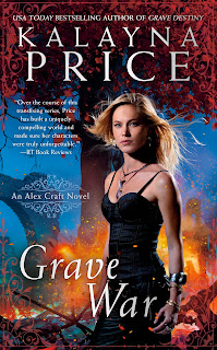
A New Look
Thanks everyone who emailed answers and opinions to my last post! I asked if I should split up my art and my writing, and the overwhelming response was to keep them on one site. So, having taken that into consideration, I've toned down the fine arts bit and splashed my book cover around.
For the design, I was going for something dark and edgy, but I think it turned out a little drab. That being the case, the site you see now is a work in progress. Hopefully in the coming days, I'll come up with something more...interesting? dynamic? colorful?
For those wondering about the cemetery image in the banner, I'll tell you a little bit about it. I took a series of photos while I was in New Orleans four years ago. This weekend I blended my favorite photos and created the image you see above (yes that is actually four different images. If you pay close attention to the angles, you can probably tell.) I like the banner, but I think it might need a little more color.
Any suggestions for the site makeover?

Comments